Sandy is a handwritten sans serif font, based on shapes made with ink brush.
Sandy is a lively and informal typeface with good readability.
Most of European languages are supported.

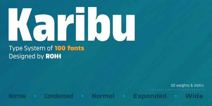
Karibu™ is a 100-font original, ultra versatile geometric grotesk family with a lot of character. It is designed for modern projects, to serve as display as well as paragraph text typeface.
It is perfect for lots of design situations - from magazine editorial use, logo design & branding, to web design, user interfaces and mobile applications.
Main features:
- 5 widths (Narrow, Condensed, Normal, Expanded, Wide), each consisting 20 fonts
- 10 weights for each width (from Hairline to Black)
- handdrawn, carefully crafted italics
- alternate stylistic set for more technical and minimalistic projects
- pronounced ink traps and large x-height improving legibility in small sizes and adding strong personality to display sizes
- flatten letter shapes adding vertical rhythm and elegance to narrow widths
- extended latin language support
- OpenType features (case sensitive forms, standard and discretionary ligatures, stylistic sets, contextual alternates, lining, oldstyle and tabular figures, slashed zero, fractions, superscript and subscript, ordinals, currencies and symbols)

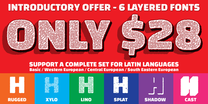
Changa is a layered font intended for titles or short texts blocks, with its short ascenders and descenders and a set of lowercase letters inscribed within a square. The uppercases case gains slightly more in height and develops its morphology in a single height in order to make it possible to create text composition with minimum line spacing.
Its counter-shapes are rectangular, featuring small curvatures in opposite vertexes which accompany and break the shapes, thus evoking a modern style.

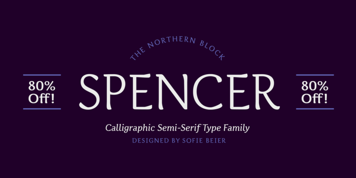
Spencer is a calligraphic semi-serif type family that has been carefully designed to provide easily distinguishable letterforms that are practical in use, as well as aesthetically appealing. It’s natural and organic forms comes from a deep consideration of the efficiency of the visible word and provides the typeface with a distinct and unique voice.
Named after Herbert Spencer, an educator and researcher of legibility at the Royal College of Art in the sixties and seventies, and influenced by other early typographers and legibility researchers, such as Walter Tracy and John Harris. Spencer was designed as part of a legibility study by Sofie Beier and Kevin Larson.
©
Alica Don
2014 . Powered by
Blogger
Blogger Templates
.
.