I’m not particularly fond of beans. I do eat them, but they’re not my idea of a delicacy… But this font has ‘fairy tale’ feeling to it, and I liked the name Beanstalker.
Beanstalker is a hand made font (I used a fineliner to draw the glyphs). It is quite neat and organized, but does come with some rough edges and a bit of texture.
Download Beanstalker Font Family From Hanoded
Download Holden Font Family From Zetafonts
Holden is a typeface family designed in 2018 for Zetafonts by Cosimo Lorenzo Pancini with Andrea Tartarelli as a research in texture and extreme weight range.
Its curvy shapes, inspired by pointed brush aesthetics, are developed in six different weights, from the lightly contrasted thin to the fluid and rhythmic fat. The lightest weights are mostly designed for text usage, while the heavier weights work better at display sizes, where the extreme shapes and tight counter-spaces are better appreciated.
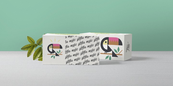
Holden aims to fill the space between display and text typeface, with a range of variants that allows maximum expression in display use and great legibility in long texts, on the web and at small size. It’s designed for editorial or packaging use where a contrasting range of weights and variants is required to fight monotony while keeping branding consistent.
All Holden fonts include full open type features with stylistic alternates, small caps, discretionary ligatures, positional number forms, swash forms (in italics) and full language coverage for +70 languages using latin alphabet.
An array of extra decorative dingbats are included to complement your design with pointing manicules and fleurons (also called “horticultural dingbats” by Robert Bringhurst in The Elements of Typographic Style).
Download Ballinger™ Font Family From Signal
Ballinger began life as a single-weight proprietary typeface called baasic, designed for Dublin-based design office aad. baasic was intended as a plain, hardworking grotesque: a simple tool for clear communication. We’ve developed it into a fully-featured eight-weight family with matching italics. Sources include early 20th century jobbing sanses like Morris Benton’s News Gothic and Candia, a 70s-era typewriter face Josef Müller-Brockmann designed for Olivetti, which had unusually deep junctures that added energy to letters like m and n.
The family takes its name from Raymond A. Ballinger, the great mid-century American designer, author of ‘Lettering Art in Modern Use,’ and champion of elegance and readability. Ballinger has large counters and a generous x-height. Letters like a, e, and s open out gradually as they move from Thin to Black to maintain ample apertures, even in the darkest weights. Semi-oldstyle figures are available, as well as case-sensitive punctuation and delimiters. Italics incorporate subtle ogee curves to lend warmth and energy to the page or screen.
Download Aila Font Family From TipoType
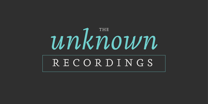
Aila is a surprising slab serif built on the structure of a realistic Roman, but with unique organic features that make this typeface an exercise in tension between structure and rhythm. This expressive tension is displayed in heavier styles (Aila Bold and Aila Black), and is strongly evident in the italic forms. Aila’s italics offer an interesting re-interpretation of the cursive ductus of classic italic forms, to offer rhythmic and swift variants, which are the ideal counterpoint to the regular set in body text.
Each style of the Aila family offers an extended character set specially designed for editorial design projects.