Sans-serif, with clean and fresh Character.
“Ye Paradigma” has been established in order to keep its forms as simple as possible - without losing the unique character of each letter, and without simplifying too much. The process was gradual, like the ripening of a sauce that leaves it to be reduced to strengthen flavors, so the letters ripened while reducing unnecessary details, until the taste became more concentrated and uniform.
The result is a clean, fresh, remarkably useful 24 fonts typeface, with a clear and stable graphic language.
Download Ye Paradigma Font Family From Yinon Ezra
Download Ye Carbon Font Family From Yinon Ezra
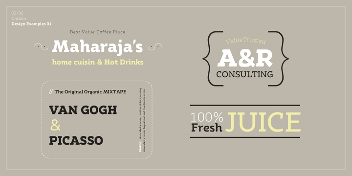
Slab-serif typeface, with pulsating and flexible forms, which gives the font its humanistic character.
Ye Carbon crystallized into its forms in search for graphic language that would represent a sense of matter, of letters written by hand. The delicate finishes at the edges of the letters, and the flexibility of the of shapes, gives a feeling of matter, and bring the font to life. Ye Carbon will be a wonderful tool for variety of uses, thanks to its neat nature, and its forms in motion vibe, a rare and winning combination.
Download Laca Text Font Family From Nova Type Foundry
Laca Text is a sans serif version of Laca. It was designed starting from the shapes of Laca. It is a cleaner version of Laca. Laca Text has characteristics like a bigger x-height, open counters, smaller ascenders. It works better in smaller text than Laca, because it keeps the structure without the stylistic features of Laca. Laca Text has more straight lines and follows the round shapes of Laca. Laca Text has true italics that are a bit quieter than Laca. Laca Text as the name says it is more proper for long text but also for identity and branding. Laca Text is versatile, and it pairs well with Laca but also stands out by as an independent style.
Download Cybermontage Font Family From Typodermic
Cybermontage is a postmodern display typeface reminiscent of a particularly rad 1980’s/1990’s typographic trend. This anything-but-boring design trend employed campy colors, clean geometric shapes, torn paper edges, faux finishes and kitschy patterns. A common tactic was to scramble glyphs from various typefaces, especially art deco, nineteenth-century grotesques, old metal headliners and minimalist geometric designs. Cybermontage uses OpenType technology to automatically shuffle several variations to create a pseudorandomized effect. If your application doesn’t support OpenType, you can access all these character variations from the Unicode Private Use Area, also known as PUA encoding.
Download Mezalia Font Family From Arrière-garde
Mezalia is a one of a kind typeface. Its shapes were strongly influenced by bastarda scripts of high medieval times. Unlike most fonts sharing similar origin, Mezalia is not just another blackletter but a fully functional text typeface, blending medieval poise and character with modern sensibilities. Stroke widths, imitating a broad nibbed pen of a scribe, fluctuate constantly giving paragraphs a characteristic vibrating texture. Despite it’s strong character Mezalia is very legible and will be an excellent choice for a book or an elegant magazine.
Mezalia has two distinct styles: straight and cursive (true italic if you will, although the word is not really correct here), which come in seven weights, from thin to black. Each weight contains a set of old-style figures, lining figures, small caps and ligatures. A separate style containing drop-cap initials is also available.