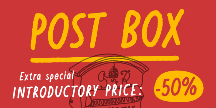
Written in a ballpoint pen style POST BOX is a neighborly sans serif is slightly condensed and slanted. Scribbled quickly but readable. Exact but still human.
Perfect for print, package and display use. You can also use it in shorter paragraph text.

Tejuela (Spanish for “Wood Shingle”) is a neoclassical type inspired by the wooden architecture of the ancient churches of Chiloé, an archipelago in southern Chile; which are World Heritage Sites. This typeface has rough and broken forms but with soft strokes.
The neoclassical characteristic of Tejuela is due to the architecture of these temples, which belong to this style but adapted to wood with excellent quality and ingenuity by Chilote builders using a material available in the area. Therefore, this typeface reflects the tradition of the fonts of that period, but adapted to the coarseness and warmth of the southern wood of the new world.
Tejuela is useful for extensive texts in literature, history, art and heritage; as also for short and large phrases in headlines according to the occasion.
Tejuela has eight variants in Roman a Italic versions, with small caps, Old Style and Lining numbers, ligatures, alternative glyphs, among other OpenType features; special mention to the capital letters Swash of the italic versions, which serve to generate delicate compositions. In addition, it has two stylistic sets to compose border ornaments inspired by the Chilote Architecture: colonnades and corners, only using the numbers on the keyboard; it is important that the line spacing has the same value as the font.
Its 800 to 940 glyphs are suitable for writing 219 different languages.
I appreciate the great help of Franco Jonas, Alexis Navarro, Marcela Aguilera, Pedro González & Diego Aravena in this process, among many people of the craft that they supported selflessly.

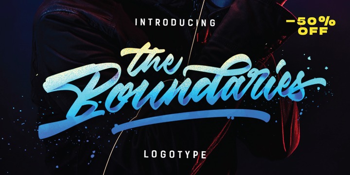
The Boundaries is a handmade Clean typeface, with authentic brush imperfections, and a very bouncy baseline It has a perfectly paired complimentary marker font , and a super handy set of bonus Swash. Ideal for logos, handwritten quotes, product packaging, header, poster, merchandise, social media & greeting cards.

Aktifo is designed with two Flavour which carries a modern and contemporary style, based on elementary geometric shapes and constructed of monolinear lines, it was invented to be functional, leaving behind anything that can be regarded as superfluous.
Aktifo comes in 28 styles: there are two types of families Actifo A and Aktifo B from Light to Black, which both have differences in characters and spaces. Developed with powerful opentype features, equipped with extended language support: Cyrillic, Greek (BETA) and fractions, tabular figures, arrows, ligatures and more.

DM PopCap was created as a typeface to accompany a 2013 LEGO project, which itself was inspired by the music video for Scream by Michael and Janet Jackson.
I had to create the typeface in order to make my own title cards. Although the resulting font looks similar to the text that appears in the music video, I also set myself the challenge of creating the remaining characters of the alphabet, as well as others that some would find useful.
As suggested, the typeface would be idea in a futuristic or technological setting, particularly concerning space travel.
For the LEGO project, I had paired this typeface with Myriad Pro. As with my other offerings, this font is intended for use as a heading or standalone title - but it also appears to work on its own for small paragraphs of text.
©
Alica Don
2014 . Powered by
Blogger
Blogger Templates
.
.