Hi! Introducing calligraphic font named “Megawatt”. It’s a script with connected letters, lots of characters including West European languages support and few ligatures.
Thank you and have fun!

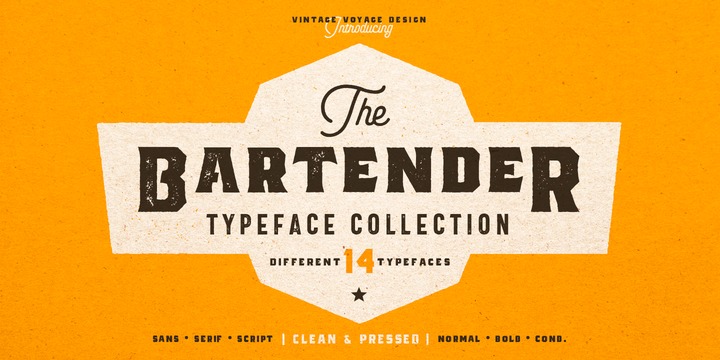
The Bartender Collection its a 14 fonts created multiple that could work together seamlessly. Six different typefaces comes with clear and pressed styles.
This collection help you hit the target with your design projects. You can create vintage looks graphics with pressed style and serif fonts, or you can use sans and be more modern. Perfectly for branding, prints, t-shirts or posters. Goes with some alternates (Aa, Bb, Hh).
Create dozens of font combinations and get really unique typographic for your project.

Indikator is a family of humanist-style sans serif fonts. There are five weights in the Indicator family; these range from Light through Bold. Each weight has both an upright as well as an italic font on offer. The italic fonts contain slanted, or oblique-style letters. The letters in each of Indikator’s weights appear virtually monolinear, in terms of stoke contrast. Strokes end in either horizontal or vertical cuts, rather than in diagonals. The fonts have a large x-height, and the lowercase letters’ ascenders are taller than the heights of the capital letters. Indikator’s numerals are tabular lining figures; these are just as tall as the fonts’ uppercase. The fonts’ OpenType features include alternate forms for the ‘I’, ‘J’, ‘4’, ‘i’, and ‘l’ – as well as a more Scandinavian version of the ‘Å’. There is also an alternate version of the zero, with a slash running through its counter. Indikator had a lot of character and verve than many other humanist sans serif families. It feels a little ‘old-timey,’ like it is channeling design ideas from the first half of the twentieth century, rather today’s Silicon-Valley-style designs. Indikator is an excellent selection for use in corporate communication or editorial design work. It will surely also come to good use in publications about contemporary culture and lifestyle issues. Indikator is the work of Frode Helland, a type designer from Norway.

The word ‘Prachar’ means publicity in Hindi. This informal-looking all-caps, slanted script face is exactly the kind of font you could use to create shop or grocery store signs that need to look hand-painted. Each letter in the font has visible stroke contrast and rough edges. Prachar was designed by Black Foundry in Paris/France, and includes a character set large enough to be able to set all European languages written with the Latin script. The typeface’s feeling is really quite dynamic; this is not due to its slant alone, but also to its letterforms’ underlying construction, which really looks like it could have come out of a sign painter’s brush. Although Prachar is an all-caps font, several of the ‘caps’ saved onto the font’s lowercase glyphs feature different forms of the letters than you’ll find on the uppercase keys. Not only do many of Prachar’s letters have rough edges, but they also look ‘roughed’ up. Especially in the ‘B’, ‘C’, ‘M’, and ‘Q’, part of the background will shine through the letterform (this is true both for print and in on-screen use). Prachar’s letters should be set as large as possible.
©
Alica Don
2014 . Powered by
Blogger
Blogger Templates
.
.