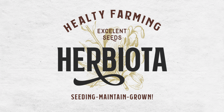
Subversia is inspired by sport and Victorian style. It is designed with elegant and solid shapes to give a modern touch, and is very suitable for your designs such as posters, flyers, t-shirts, logos, signage, branding, the even body text for magazines.
Subversia has all-caps characters as Stylistic set in OpenType features that gives you greater variant of typographic possibilities, especially in headlines. This set also has ligatures, stylistic alternates and swashes to make your design look more natural and elegant. 400+ glyphs total with 23 languages.
This font is designed with adaptive and flexible looks that possible to apply in other styles outside vintage. With the italic style you can use this font for a sporty theme, minimalism, pop contemporary, dark theme, feminine or editorial project.
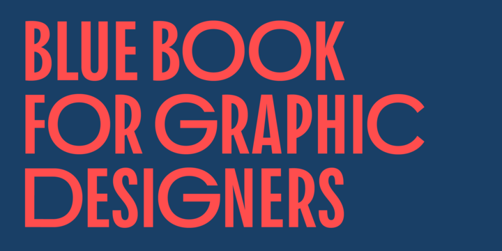
Download Replete Sans Font Family From Sudtipos
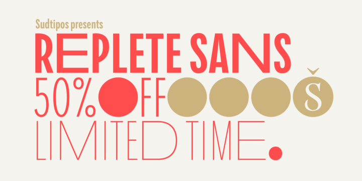
Sudtipos’ new sans serif font Replete is inspired by the mixture of aesthetics and philosophies found on the streets of metropolitan cities the world over. Buildings constructed throughout the twentieth century, including those made in the Art Deco style or influenced by the Bauhaus’s gospel, stand side-by-side as symbols of their time. Typography is one factor that bonds these vistas, and simultaneously further complexifies them. Art deco letters appear on storefronts and signage in Europe’s oldest cities and as remnants of the Golden Age of economic expansion for Latin America. Typography, like architecture, sometimes coexists in perfect harmony, and other times in ideological opposition.
But it is these juxtapositions in places such as Shanghai, New York, London, Buenos Aires and Tokyo that shape each city’s identity. Replete is inspired by this mixture. We wanted to create a useful modern sans serif family – a set of 7 weights with playful geometric alternates – that allows you to combine characters including wide-width and filled letterforms. Replete is apt for long texts, and equally, for instances where letterforms can stand together like a cityscape.
Replete means full, packed and abounding … it is a sans, it is grotesque, it is geometric and it is Deco. Replete is a new family that has a little of everything we like, equipped with everything you need to design anything you want.
Download News Sans Compressed Font Family From CharacterType
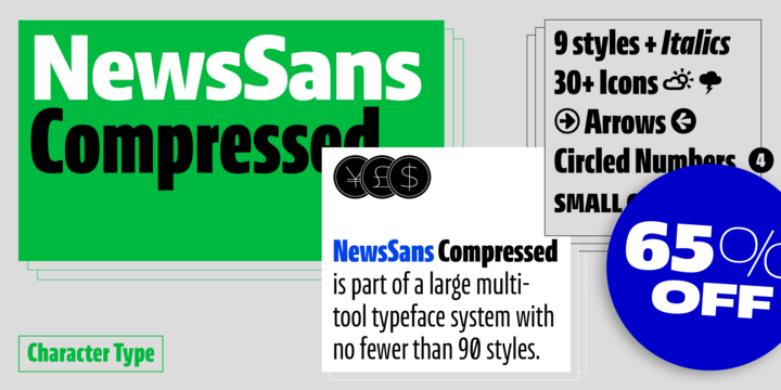
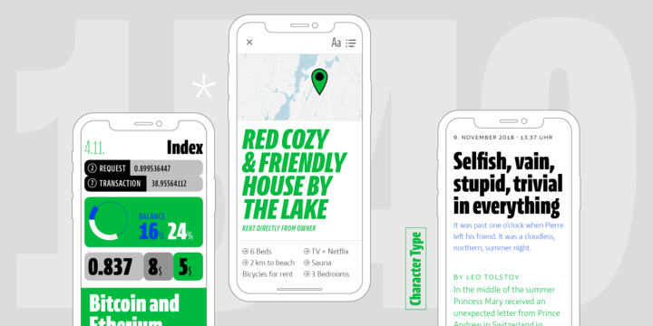
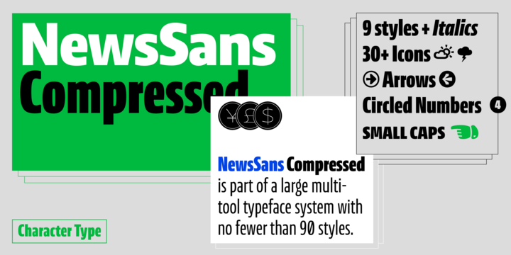
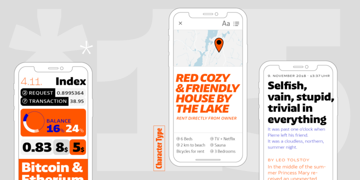
NewsSans Compressed is a multi-tool typeface system. It works well in all corporate, editorial, analog and digital settings.
The News Sans family was designed to allow for a maximum range of visual shades when creating a typographic look, effortlessly ranging from loud and expressive, to subtle and reserved. The large x-height combined with low ascenders and descenders allows for tight and efficient designs. All sharp corners were trimmed off to add character and a nuance of extra space. NewsSans’ strokes link humanist curves with ‘American Grotesque’ details and solid square stems.
NewsSans is optimized (hinted) for best screen performance.
Download News Sans Wide Font Family From CharacterType
November 07, 2019
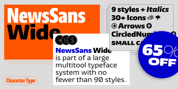
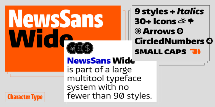
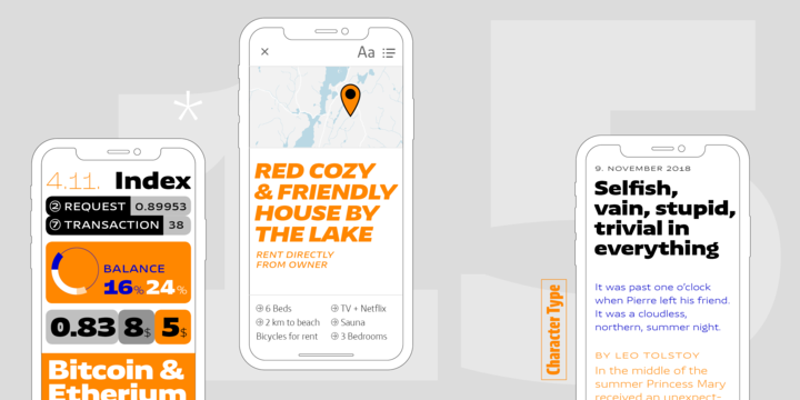
NewsSans Wide is part of a multi-tool typeface system. It works in all corporate, editorial analog, and digital settings. NewsSans is optimized (hinted) for best screen performance.
It was designed to allow a maximum range of visual shades when creating a typographic look, effortlessly ranging from loud and expressive, to subtle and reserved. The large x-height combined with low ascenders and descenders allows for tight and efficient designs. All sharp corners were trimmed off to add character and a nuance of extra space. NewsSans’ strokes link humanist curves with ‘American Grotesque’ details and solid square stems.
Download News Sans Extended Font Family From CharacterType
November 07, 2019
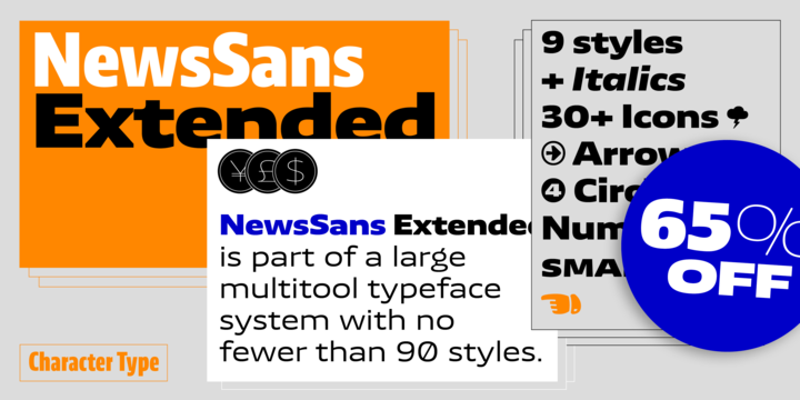
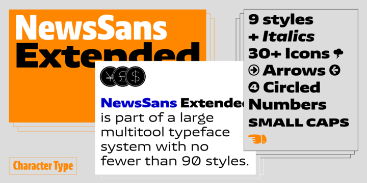
NewsSans extended is part of a multi-width typeface system. It works in all corporate, editorial, analog and digital settings. NewsSans Extended is optimized (hinted) for best screen performance.
It was designed to allow a maximum range of visual shades when creating a typographic look, effortlessly ranging from loud and expressive, to subtle and reserved. The large x-height combined with low ascenders and descenders allows for tight and efficient designs. All sharp corners were trimmed off to add character and a nuance of extra space. NewsSans’ strokes link humanist curves with ‘American Grotesque’ details and solid square stems.
Subscribe to:
Comments
(
Atom
)

